CASE STUDY
It Starts With Yellow
A calmer, clearer website redesign for a nervous system regulation and holistic bodywork practice in the Noosa Hinterland.
Akiki Spinal Flow already had a powerful message. Our job was not to change the heart of the business - it was to help the website reflect it better.
Project Snapshot
CLIENT
Akiki Spinal Flow®
INDUSTRY
Wellness & Holistic Health
PROJECT TYPE
Website Rescue
LOCATION
Noosa Hinterland, QLD
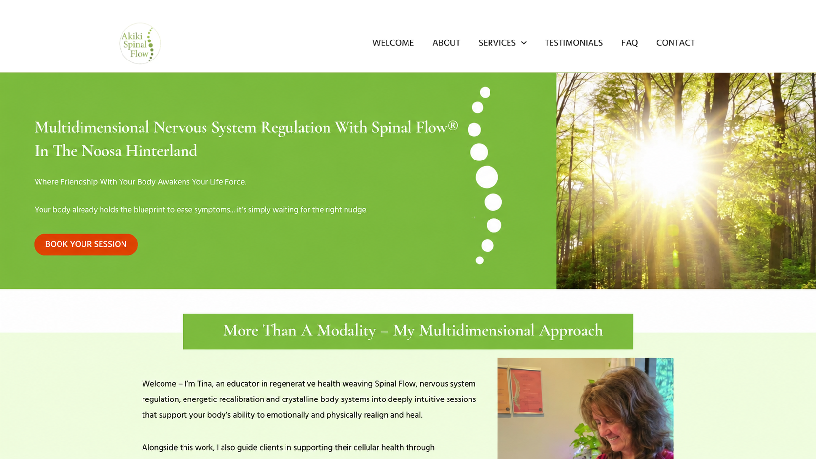
A website with more calm, clarity and connection.
Tina’s work is deeply personal, intuitive and grounded in the body’s natural intelligence.
The previous website had heart, warmth and meaning, but the layout needed refinement. The page flow felt harder to move through, the first impression needed strengthening, and the booking pathway needed to be easier for visitors to find.
South Star Designs redesigned the website to feel more aligned with the experience Tina creates in person: calm, safe, natural and deeply connected.
Before & After
The redesign kept the heart of Akiki Spinal Flow while improving the first impression, mobile experience and booking journey.
BEFORE
The original site carried Tina’s message, but the design felt more text-heavy and less refined. Important information was there, but the page experience needed more structure, visual calm and clearer direction.
AFTER

The redesigned site gives Akiki Spinal Flow a stronger first impression, cleaner mobile experience, clearer messaging and a more natural path toward booking.
The goal was not to change the heart of the business.
It was to help the website reflect it better.
We kept Tina’s words, her natural tone and the grounded energy of the brand, then rebuilt the website experience around clarity, trust and ease of use.
What We Kept
Some websites need a full repositioning. This one did not.
Akiki Spinal Flow already had a beautiful message. The redesign was about preserving what made the business feel real while improving how that message was presented online.
Checklist:
✓ Tina’s words
✓ The natural feeling
✓ The calm, grounded energy
✓ The core message of her work
✓ The gentle, body-led approach
✓ The connection to nature and safety
The Challenge
The website needed to feel more polished without becoming cold, clinical or overly corporate.
01.
Clarify The First Impression
New visitors needed to understand what Tina does, who she helps and where she works within the first few seconds of landing on the site.
02.
Improve The Page Flow
The existing content had meaning, but the structure needed to guide visitors more naturally from curiosity to trust to booking.
03.
Make Booking Easier
The booking pathway needed to be more visible and accessible without making the site feel pushy or sales-heavy.
The Solution
Stronger Hero Section
The new hero section gives visitors an immediate sense of Tina’s work, her location and the calm energy behind the brand.
Clearer Mobile Experience
Because many visitors will first experience the site on their phone, the mobile layout was a priority.
The new design uses stronger spacing, clearer section breaks, more visual rhythm and an easier path through the content.
Softer Visual Direction
We leaned into natural greens, organic imagery, gentle textures and Tina’s personal photography to create a website that feels grounded, safe and human.
Easier Booking Access
The booking call-to-action was made clearer across the site, giving visitors a simple next step when they feel ready to book a session.