
01
Stronger Core Message.
The website was centred around a simple, memorable idea: It started with Yellow.
This gave the brand a clear entry point and helped make the product story easier to follow from the homepage.
CASE STUDY
A bold, information-led website built to make the product story easier to understand, trust and explore.
The product range is powerful, but it can also feel overwhelming for new visitors. Our job was to turn a large amount of product, science and opportunity information into a website that felt clear, structured and easy to move through.
CLIENT
The AgeWell Movement
INDUSTRY
Health, Wellness & Product Education
PROJECT TYPE
Business Website
LOCATION
Australia Wide
This project centred around a broad wellness product ecosystem covering cellular health, healthy ageing, collagen, skin care, hair care, gut health, brain performance and weight management support.
The challenge was not a lack of information.
The challenge was making that information easier to understand.
South Star Designs helped create a cleaner, more structured product information website that could educate visitors, support conversations and give people a simple way to explore the brand story without feeling overwhelmed.
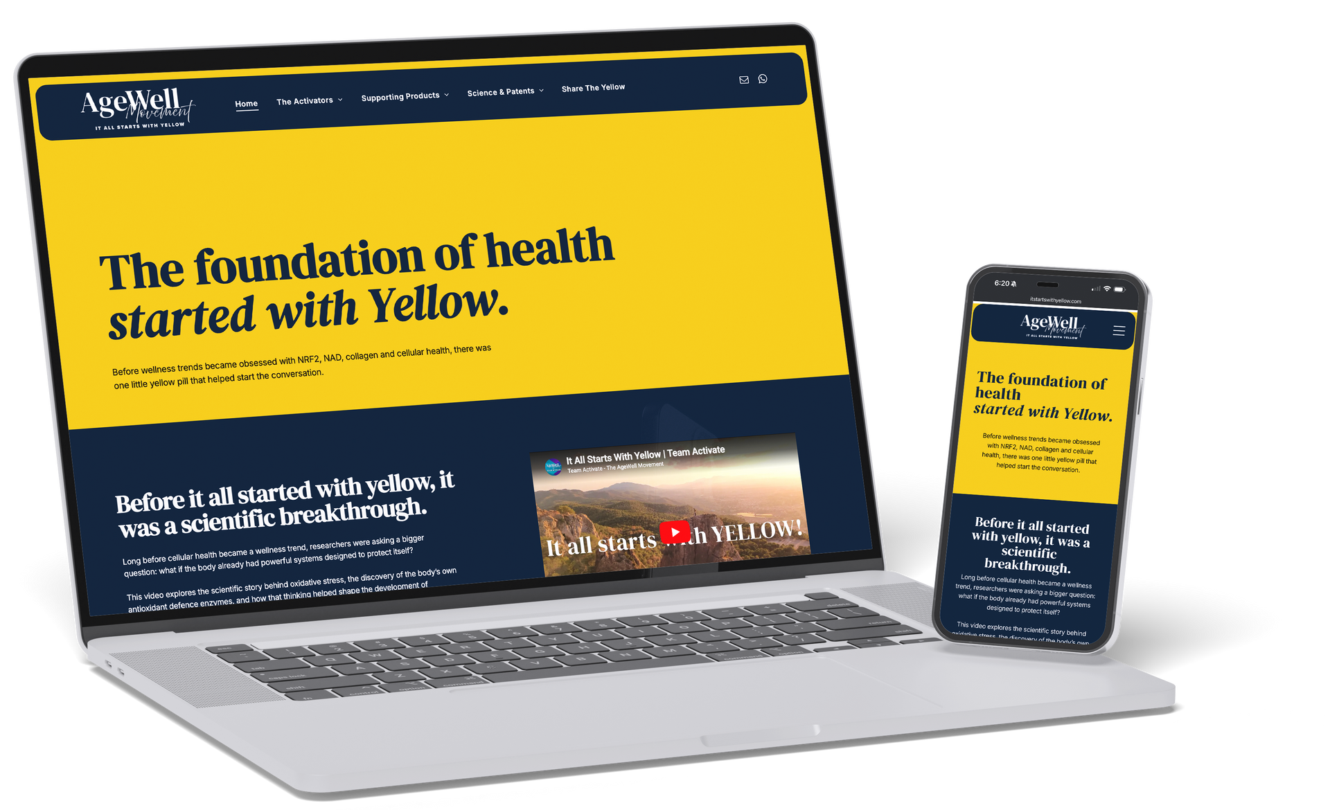
The redesign gave the brand a clearer structure, stronger visual identity and a more guided path through the product information.
BEFORE
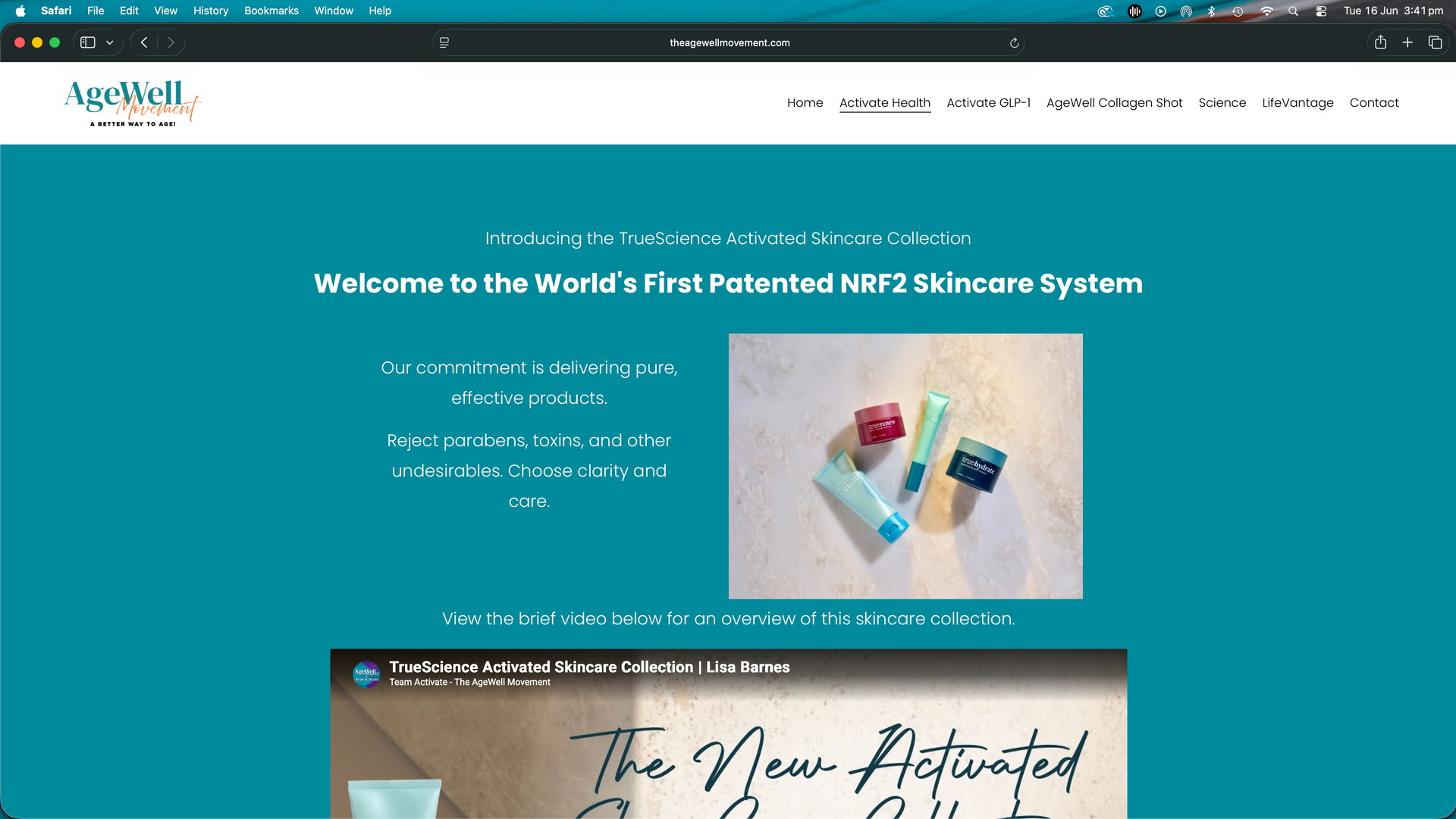
The original online experience had a lot of valuable information, but the message was spread across too many ideas at once.
For new visitors, it could feel difficult to know where to start, what mattered most or how the different products connected together.
AFTER
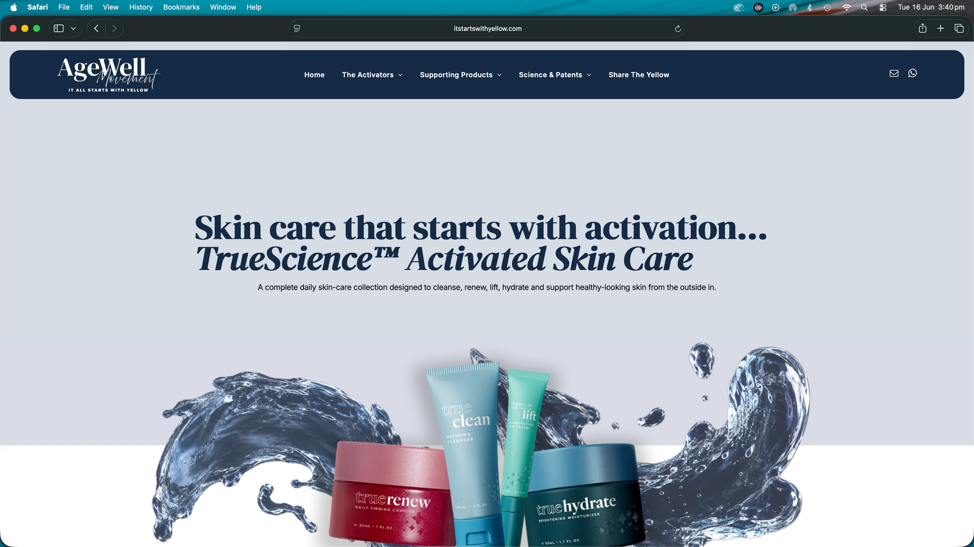
The updated site created a stronger central idea. From there, the website became easier to follow. The story begins with the foundation product, then expands into the broader product ecosystem, supporting science, patents, business information and next steps. The result is a website that feels more intentional, more professional and easier for visitors to explore.
We took a complex product and science story and shaped it into a more guided website experience - one that could educate, build trust and help visitors take the next step with more confidence.
The project already had strong ingredients: a passionate brand message, a compelling product story and a clear belief in the body’s ability to function better when properly supported.
The redesign was about organising those ingredients into a better user journey.
Checklist:
✓ The broader product story
✓ The focus on activation, not just supplementation
✓ The science-led positioning
✓ The AgeWell Movement brand direction
✓ The goal of educating before selling
✓ The pathway from product curiosity to conversation
The website needed to explain a large amount of information without making the visitor feel like they had to understand everything at once.
01.
Simplify A Complex Product Ecosystem
The brand offered multiple products, stacks and categories. The challenge was creating a structure that helped visitors understand the bigger picture without getting lost in the details.
02.
Build Trust Through Education
The site needed to feel more credible, more organised and more helpful - especially for visitors who were learning about the products for the first time.
03.
Create A Clearer Journey
The website needed to guide people from the main story into product pages, science, studies, patents, business information and contact points in a way that felt natural.
A clearer, education-led website built around a memorable core message, organised product pathways and a bold, professional brand presentation.
The website was centred around a simple, memorable idea: It started with Yellow.
This gave the brand a clear entry point and helped make the product story easier to follow from the homepage.
The product information was organised into clearer categories so visitors could explore based on what they were interested in — cellular health, collagen, weight management support, skin care, hair care, brain performance, supplements, science and patents.
This helped turn a large product ecosystem into a more usable website experience.
The visual direction was designed to feel bold, modern and confident while still keeping the website approachable.
The yellow and navy colour system helped create a strong brand feel and gave the site a more memorable identity.
Rather than pushing visitors straight into a sale, the site was structured to educate first.
Each section was designed to help visitors understand the product story, explore the supporting information and feel more confident before taking the next step.
Charlotte shares her experience of creating a more professional online presence for The Agewell Movement.
I can highly recommend Robby for your business website needs. He is extremely talented, creative, and flexible, and made the whole process easy and stress-free.
My website has taken my business to a new level of professionalism.

South Star Designs. All rights reserved.