CASE STUDY

CASE STUDY

That Nano Chic - Service Business - Website Rescue Case Study

A complete website rebuild for a Sunshine Coast Nanoplasty specialist who needed a site that finally reflected her personality, experience and business.

After a disappointing experience with another website provider, we started again - creating a bold, custom digital experience that makes Nanoplasty easier to understand, showcases real transformations and gives potential clients a clear path from curiosity to booking.

Project Snapshot

CLIENT

That Nano Chic

INDUSTRY

Hairdressing & Nanoplasty

PROJECT TYPE

Full Website Rebuild

LOCATION

Bli Bli, QLD

This wasn't Colleen's first attempt at a new website.

Shortly before coming to South Star Designs, Colleen had invested around $2,000 with another website provider to have a new website built for That Nano Chic.


Unfortunately, the result wasn't what she had expected.


The site felt generic, heavily AI-generated and disconnected from both Colleen's personality and the experience she wanted to create for her clients.


When she tried to have the issues addressed, communication with the provider eventually stopped.


Colleen was left with a website she didn't want representing her business - and faced with the frustrating prospect of paying to have the whole thing done again.


So this project became more than a redesign.


It became a website rescue.

Laptop and smartphone displaying a responsive website with green and white design

THE BRIEF

“Blingy… but not too feminine.”


That was essentially the creative brief.


Colleen knew she wanted the website to feel glamorous and different.


She loved purple, silver, chrome, diamonds and a little bit of sparkle - but she didn't want it to turn into a stereotypical pink beauty salon website.


There wasn't an existing website style or visual reference we were trying to recreate.


We needed to work out what That Nano Chic should look like online.


And creatively, this was something completely different for South Star Designs too.

THE CREATIVE CHALLENGE

Designing outside our usual comfort zone.

Most websites we had designed previously leaned towards clean, modern and relatively restrained visual styles.


That Nano Chic called for something completely different.


It needed chrome.

It needed jewels.

It needed movement.


It needed oversized imagery, layered textures and strong purple tones.

And somehow, all of those elements still had to come together without becoming overwhelming or excessively feminine.


The challenge was finding the balance between bling and sophistication.

Instead of treating the unusual brief as something to tone down, we leaned into it.

The result became one of the most distinctive websites we've created.


BOLD • GLAMOROUS • UNMISTAKABLY THAT NANO CHIC

Before & After

The goal was not to replace Fresha. It was to create the branded experience that should happen before the customer reaches the booking page.

BEFORE

Green website homepage with sunlit forest hero image and a person reading in a content section

The previous website had been created only recently, but it didn't communicate what made That Nano Chic different.


The design felt generic.


The messaging lacked personality.


Colleen's 40 years of industry experience wasn't given the prominence it deserved.


Nanoplasty itself wasn't explained clearly enough for someone discovering the treatment for the first time.


And there wasn't a strong customer journey connecting education, pricing, questions and booking.

AFTER

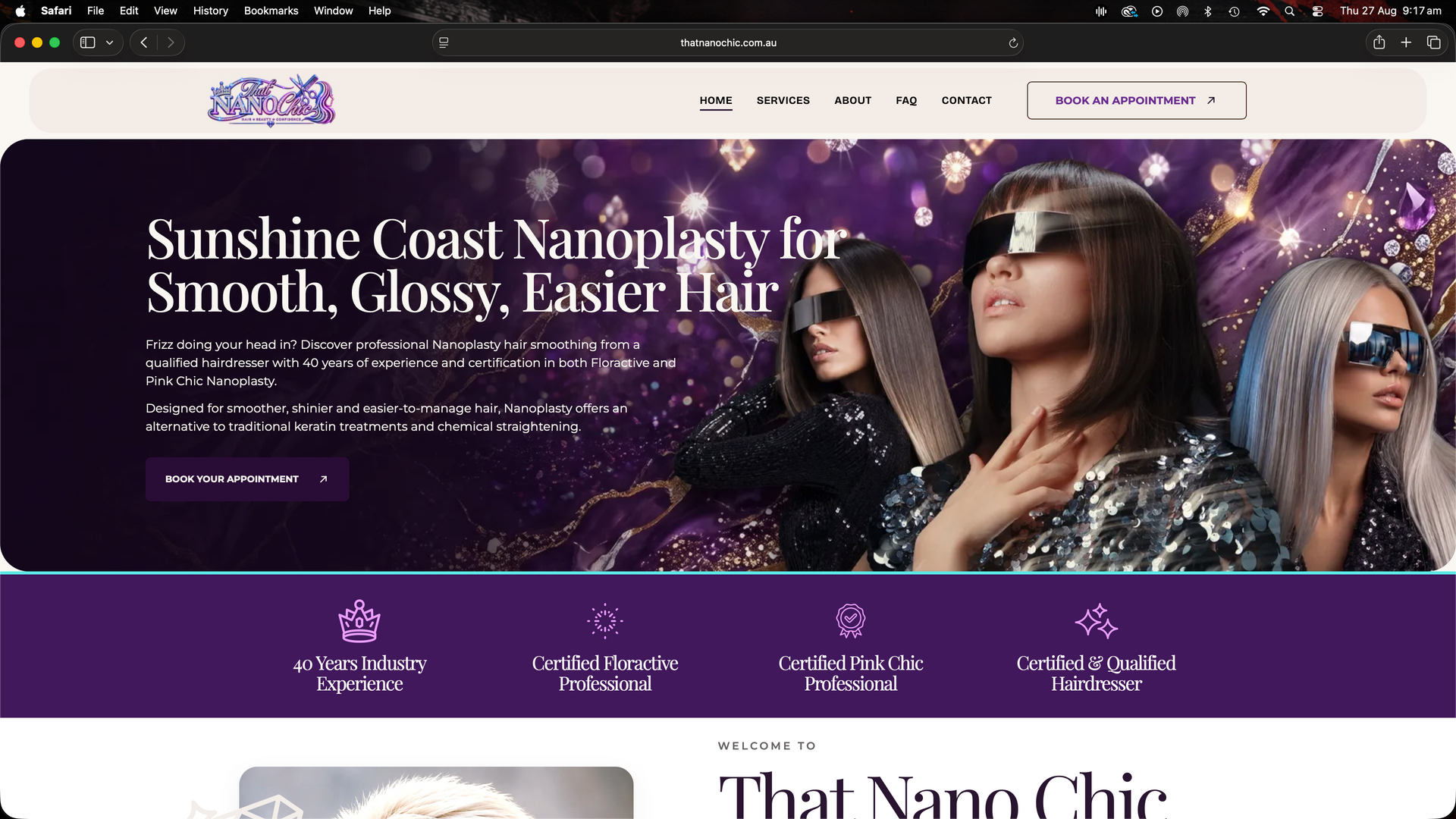
Website homepage with woman portrait and headline about multidimensional nervous system regulation with spinal flow in the Nosa hinterland

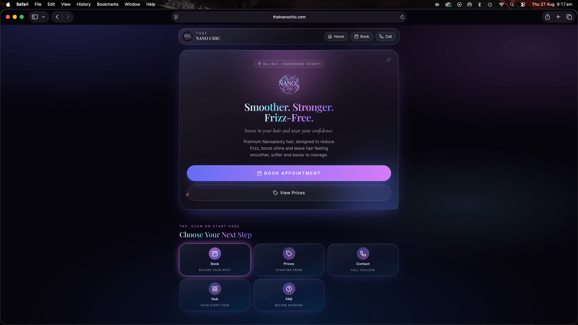
The new website was rebuilt around the actual client experience.


Visitors can now understand what Nanoplasty is, learn how it differs from other smoothing treatments, explore starting prices, see genuine hair transformations and search detailed answers to common questions.


They can also learn about Colleen, understand her approach and easily contact her if they aren't sure which treatment or pricing category applies to their hair.


Visually, the website now feels completely unique to the business.


Purple. Silver. Chrome. Diamonds. Movement. And plenty of bling.


But all balanced against clean typography, generous space and structured content so that the website still feels professional and easy to use.

The Challenge

There were several problems the new website needed to solve.

Rebuild Trust in the Website Process

After already spending approximately $2,000 on a website she wasn't happy with, Colleen was understandably cautious about starting again.


This meant the process needed to feel different from the beginning.


Communication was frequent.

Design decisions were collaborative.

Feedback was incorporated throughout the build.


Rather than disappearing and returning with a finished website, we developed the site together.


A website process built around communication.

Create a Brand Direction From a Very Open Brief

“Blingy but not too feminine” gave us plenty of creative freedom - but also very few rules.


We developed the visual language as the site evolved, combining deep purple, silver and chrome elements with diamonds, textured backgrounds, custom imagery and dramatic typography.


Each new section became an opportunity to push the design slightly further while maintaining consistency across the website.


Creative freedom without losing cohesion.

Make Nanoplasty Easy to Understand

Nanoplasty is still unfamiliar to many potential clients.


People often arrive knowing the problem they want solved - frizz, difficult styling, excessive volume or unmanageable hair - without necessarily knowing the treatment they need.


The website therefore couldn't assume that visitors already understood the service.


Information needed to be simple, visual and easy to navigate.


Education before conversion.

THE SOLUTION

A website designed around how clients actually make the decision.

Instead of treating every visitor like someone who is ready to book immediately, the new site supports people at different stages of the buying journey.

Some want to understand Nanoplasty. Some want to compare it with Keratin. Some want pricing. Some need reassurance. Some just want to see the results.

The website gives each of them a clear next step.

01

A Completely Custom Visual Direction

We developed a design language specifically for That Nano Chic rather than forcing the business into an existing template or generic salon aesthetic.

Purple gradients, metallic elements, diamonds, layered backgrounds and bold editorial typography give the website its personality.

The design feels playful and glamorous without becoming difficult to navigate.
02

Treatment Education Without the Overwhelm

The site explains Nanoplasty using straightforward, client-friendly language.

Rather than relying on long blocks of technical information, key concepts are broken into shorter sections that answer the questions people actually ask.

Visitors can quickly understand what the treatment does, who it may suit and what sort of result they can expect.

03

Nanoplasty vs Other Treatments

One of the biggest sources of confusion is understanding how Nanoplasty differs from Keratin treatments and chemical straightening.

We created a dedicated comparison experience that allows visitors to see the differences quickly rather than trying to piece the information together themselves.

This helps clients understand not only what Nanoplasty is - but why they may choose it.

04

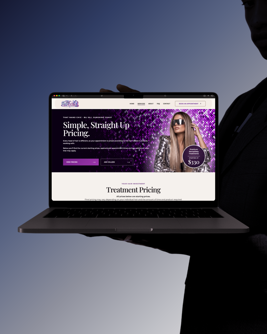
Transparent Pricing

Rather than hiding prices behind a consultation, the website gives clients clear starting prices based on hair length.

Short. Medium. Long. Extra Long.

We then explain why density, texture, condition and product requirements may affect the final price.

It's straightforward without pretending every head of hair is the same.

05

Searchable FAQs

We created an extensive FAQ resource covering the questions Colleen hears from clients every day.

Nanoplasty. Curly hair. Colour and bleach. Treatment longevity. Aftercare. Pricing. Products. Booking.

A custom search feature allows visitors to type what they're looking for and quickly find relevant answers.

And if they still can't find it, they're directed straight to Colleen.

06

Real Hair Transformations

With a visual treatment like Nanoplasty, results matter.

Before-and-after imagery is used throughout the website to demonstrate the transformation rather than simply describing it.

The hair becomes some of the strongest marketing content on the site.

07

A Better Way to Enquire

Not every visitor knows what to book.

The contact experience was built to accommodate that.

Potential clients can explain what they're looking for, provide information about their hair and send through a current photo.

It gives Colleen the information she needs while making the process far easier for someone who isn't sure where to begin.

08

SEO & AI Search Foundations

The website was structured around the questions potential Nanoplasty clients are already searching.

Clear page topics, descriptive headings, location-focused content, detailed FAQs, internal linking and comprehensive treatment information give search engines more context around the business.

The goal wasn't simply to create something that looked good.

It needed to be something Google - and emerging AI search platforms - could understand.

PROJECT DELIVERABLES

What We Delivered

Website Strategy

A complete rethink of how That Nano Chic communicates Nanoplasty and guides potential clients through the decision-making process.

CUSTOMER JOURNEY
Strategy before styling.

Copywriting

Clear, conversational website copy designed around real customer questions rather than generic salon marketing.

BRAND VOICE
Clear. Useful. Human.

Custom Website Design

A completely bespoke purple, silver, chrome and diamond-inspired visual direction created specifically for the That Nano Chic brand.

Custom Development

Purpose-built sections and interactive elements created beyond the limitations of standard website widgets.

Responsive Design

Desktop and mobile layouts carefully adapted so the highly visual design remains usable across different screen sizes.

RESPONSIVE LAYOUT

Searchable FAQ System

A custom FAQ resource designed to help clients quickly find answers to their Nanoplasty questions.

FAQ
ASK
FIND
LEARN

Pricing Experience

Simple starting-price categories supported by clear explanations around individual hair requirements.

CLEAR PRICING
Straight-up starting prices.

Conversion Strategy

Multiple pathways for visitors to book, ask questions, call, text or submit their hair details before making a decision.

GO
BOOK
ASK
TEXT

SEO Foundations

Page structure, headings, content hierarchy and location-focused copy built to support long-term organic and AI-assisted search visibility.

SEARCH FOUNDATION
Testimonials

Hear from Colleen...

A few words from Colleen about her experience working with South Star Designs on the new That Nano Chic website.

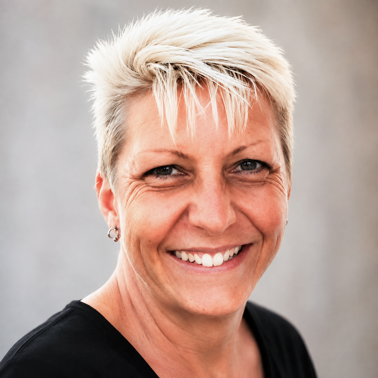
Colleen from That Nano Chic

Owner · That Nano Chic

Colleen

★★★★★
“Exceptional Service!!! 5-Stars ☆☆☆☆☆ I had a website created but got scammed by the person 😠 Talia and Robbie came to my rescue by helping me create a New and Better website that truly represents me and my business 💯. If your looking for friendly, reliable website designers then South Star Web Designs are truly outstanding professionals!!

Thank you both So much 💜”
That Nano Chic · Website Design
THE RESULT

A website that finally feels like That Nano Chic.

This project started with a client who had every reason to be frustrated with websites.

WHERE WE STARTED

She had already invested around $2,000.

She had already gone through the design process.

And she had already been left with something that didn't represent her business.

THE REAL GOAL

The goal wasn't simply to replace the old site.

It was to create something Colleen could actually feel excited to send people to.

The finished website is bold, informative and completely different from anything we had designed before.

And that is exactly why it works.

It doesn't look like a generic hair salon.

It doesn't sound like a generic beauty website.

IT LOOKS LIKE That Nano Chic.

Need a website that finally feels like your business?